
 昨日お話しました、カーディガンのもうひとつのパターンに使用するプリントの試刷りです。ホワイトにネイビーでL、グレーメランジに少し濃い目のグレーでP、ラッキーグリーンに薄めのグレーでW、マリンにホワイトでRのプリントとなりますが、通常のプリントと少し違います。今までにない全く新しい手法を考えてみました。一度ベースカラーとしてラバープリントをそれぞれの身生地にあったインクでプリントをして、その上からフロッキーでさらにプリントをするという2工程かけたプリント技法をとってみました。ベースのインクカラーとその上にのせるフロッキーのカラーの組合せでずいぶんと色の表情が変わってきます。今回、ホワイトボディ以外は、少しぼやけた雰囲気を表現したかったので、何度もテストをおこないましたが、最終的には雰囲気が出たのではないかなと思っています。左胸にそれぞれLPWR、左袖に2本ラインのちょっとオールドスクールな雰囲気がするカーディガンができるかと思います。こちらもリリースは来年の1月中旬以降になるかと思いますので、お楽しみにしていただけましたら嬉しいです。@鈴木さとし
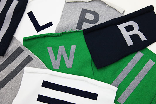
This is the test print to be used for the additional cardigan pattern that I mentioned yesterday. For the letter L it will be navy on white, for P it will be a slightly darker grey on grey mélange, for W it will be a slightly lighter grey on lucky green and for R it will be white on marine, however these prints will differ slightly from the ones that we normally use. I thought of a completely new printing technique that we have not used up until now. First we use a rubber print and ink to print onto each piece of fabric for the base color. We then use a flock print on top of the ink print (a flock print involves using a design cut from colored foil that is then pressed onto the fabric at high temperature). This is the dual process printing technique with which I experimented.
The combination of the base ink color and the flock color on top gives a considerably different visual appearance to the color of the print.
This time I wanted rather than a white body, to be able to present something with more of a dim and blurry ambience to it and finally, after countless tests I think that I have achieved the right effect. With either the L,P,W or R on the left side of the chest and the two lines on the right arm, I think that this cardigan achieves something of an old-school vibe. This item too will be released from around the middle of January, so I’d be really happy if everyone starts getting excited! @Satoshi Suzuki
コンテンツへスキップ